The Children’s Inn at NIH
Background
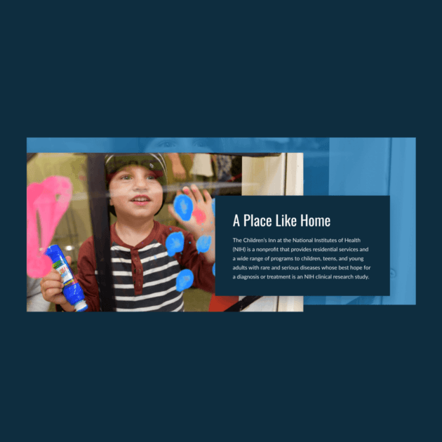
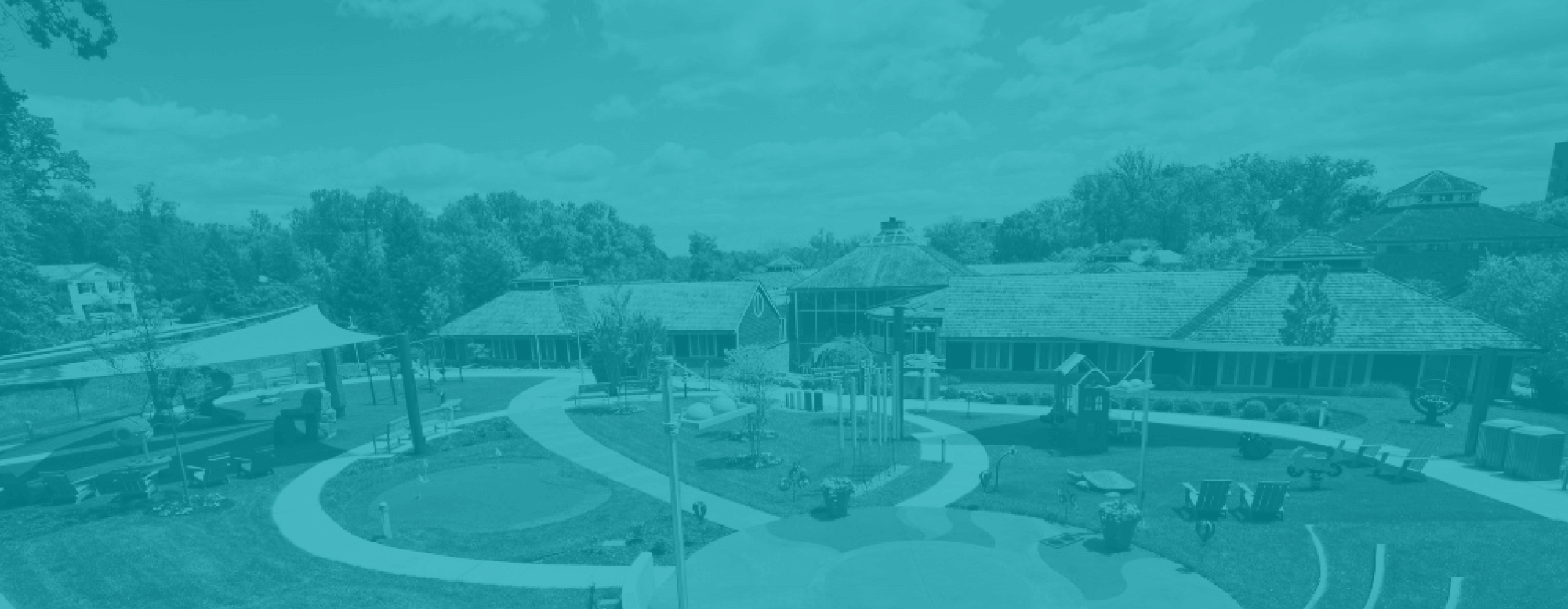
The Children’s Inn at NIH is a nonprofit that makes childhood possible. They provide free lodging, services, and activities to children, teens, and young adults with rare and serious diseases whose best hope for a diagnosis or treatment is an NIH clinical research study. Since 1990, The Children’s Inn at NIH has helped more than 14,500 families experience ‘a place like home.’ Their goal is to create a future in which no family has to endure the heartbreak of a seriously ill child.
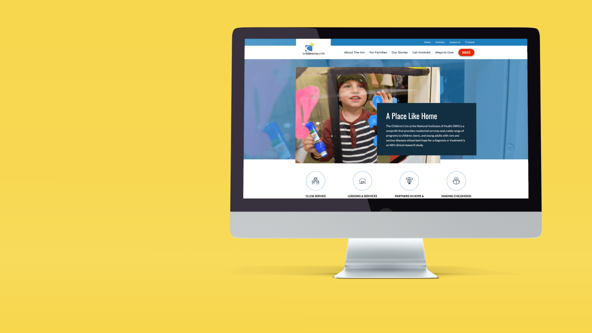
The Children’s Inn at NIH partnered with Mindgrub to create a more informative, intuitive, and inclusive website that would integrate with their donation management system.
We created an enhanced experience through extensive discovery, user research, and interface modernization with WordPress. We also helped implement the necessary back-end system upgrades to provide a seamless experience for donors, families, and volunteers alike.
“As part of our #INN2025 strategic campaign, it was critical that The Children’s Inn at NIH launch a new website. With functionality and accessibility in mind, we wanted to create a site that was informational, inclusive and user-friendly to our families and committed supporters.”
Mission-driven Design
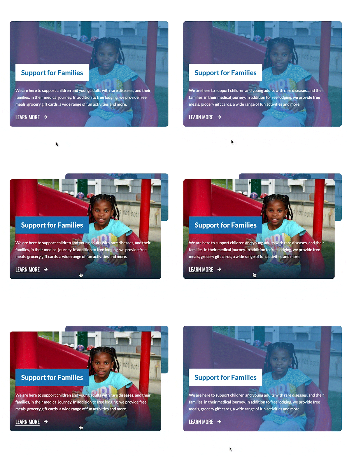
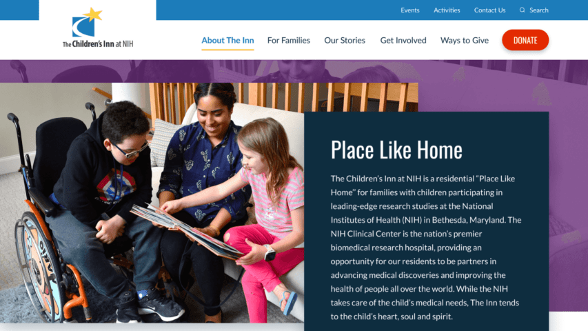
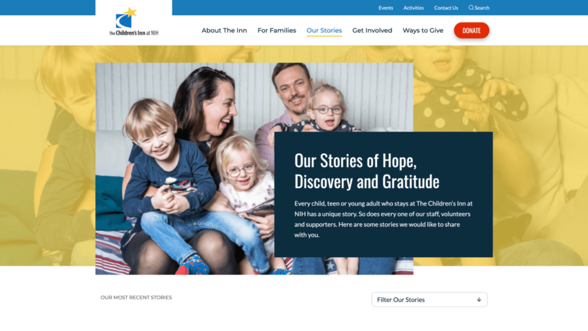
We created a new digital experience for The Children’s Inn at NIH, showcasing their brand and purpose through impactful storytelling and imagery of children, teens, and young adults at The Inn, bright colors, and call-to-action messaging. This provides an immediate sense of who they are, what they do, and why their mission is so important. By adding more elements of storytelling to the site, we developed a more engaging experience for families, donors, and volunteers alike.
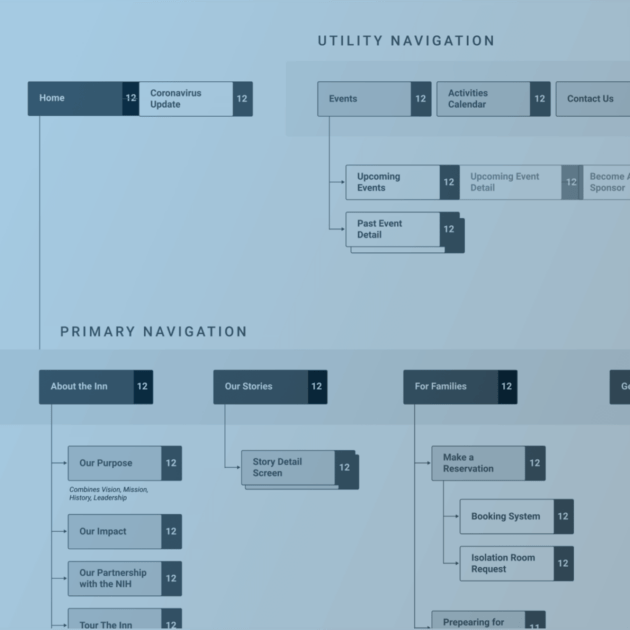
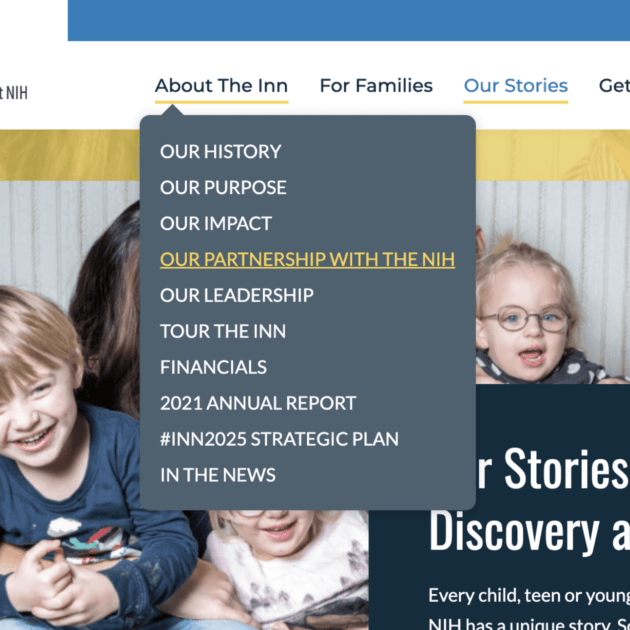
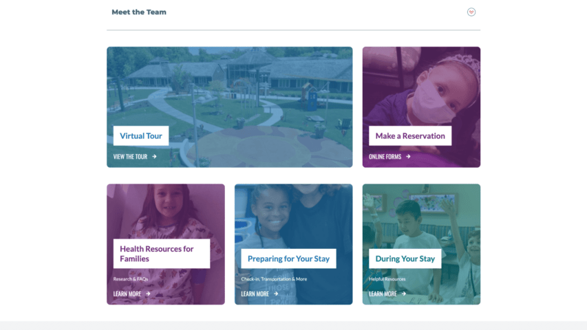
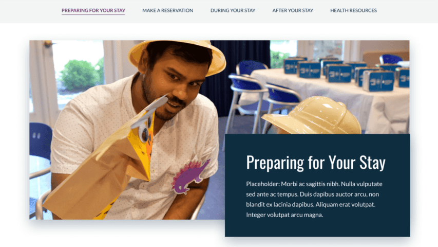
The previous site was confusing to navigate, which resulted in a lot of confusion and phone calls to The Inn. Our team worked to create a more intuitive navigation and information hierarchy, allowing users to easily and quickly find the information they need.
Developing for Community
From a user perspective, donors found the previous site extremely difficult to navigate. Those that were able to figure out how to donate often received receipts containing incorrect information. Certain donation options, such as recurring donations, were also not available to users, resulting in a countless amount of lost donations.
We worked with The Children’s Inn at NIH to upgrade their current systems and update their existing WordPress environment.
In addition, we integrated a more streamlined donation system—Classy, a platform built for giving. Their previous platform required a lot of custom coding, which created a lot of issues and resulted in a 7% donation rejection rate. With Classy, we improved their back-end systems to integrate with their donor database. This will help with future targeted marketing efforts and reduce the amount of rejected donations.
Training for Success
We empowered staff to make their own edits to the site by upgrading their WordPress environment to Gutenberg. This simple, easy-to-use platform allows staff to seamlessly edit and add new pages and additional components to their existing pages.
To ensure that staff at The Inn fully understood the new Gutenberg platform, we conducted an in-depth training, taking the time to showcase all of its features and functionalities, as well as address questions. Now, team members at The Inn can easily make website updates and create additional pages on an as-needed basis, without reaching out to a vendor.
“Mindgrub’s team of accomplished professionals helped us every step of the way. They have been essential in the process to improve how we can effectively tell our story and impact to current, new and diverse audiences.”
Results that Matter
We created an easy-to-use website navigation that focused on improving donor experience, as well as making the site more intuitive for families.
Our overhaul of The Children’s Inn at NIH’s back-end systems resulted in a more streamlined donation collection system. This optimization will increase donations by reducing the number of rejections, collecting recurring donations, and capturing donor information. Since the launch of their new website, The Children’s Inn at NIH receives an average of 57,000 more impressions per month, ultimately increasing the amount of potential donations.
We’re passionate about working with mission-driven organizations focused on helping others. We were delighted to have the opportunity to help The Children’s Inn at NIH become one step closer to their goal of creating a future in which no family has to endure the heartbreak of a seriously ill child, teen, or young adult.
If you’re interested in learning more about what we can do for your nonprofit, contact us today—we’re always happy to help!
