TAK
Background
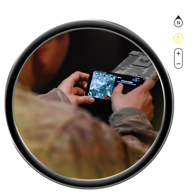
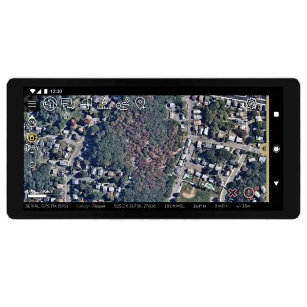
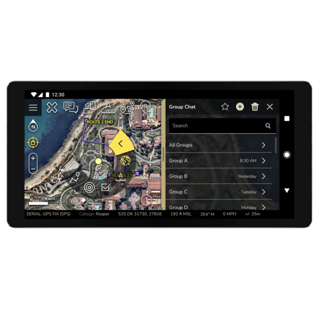
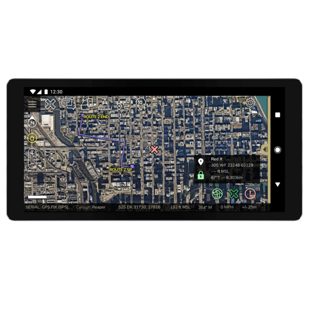
The Tactical Assault or Team Awareness Kit (TAK) is a display point location product owned by the U.S. Government (USG). Equipped with an extensible plugin architecture and features such as position data, chat, mission planning, and shared overlays, this map-based software application enables thousands of users to coordinate and complete specific mission sets.
The TAK Product Center engaged with Mindgrub to further develop TAK’s user experience and ability to seamlessly interact with multiple platforms and local TAK servers.
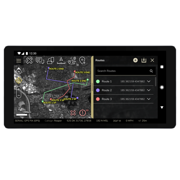
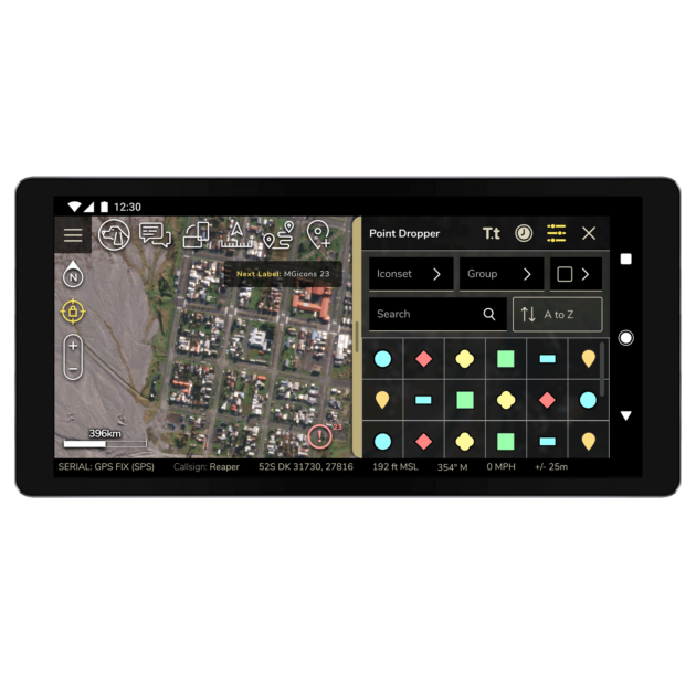
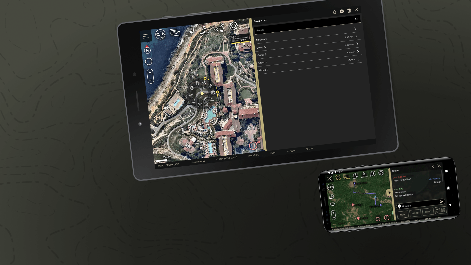
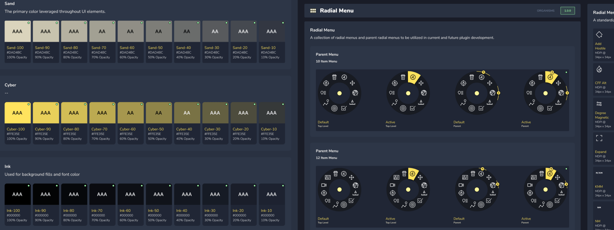
Mindgrub redesigned the TAK interface and developed a unified product style guide, working with the TAK team toward a single ecosystem solution that is scalable and repeatable across different devices, products, and teams.
Our Approach
After discussing long-term goals and overall strategy, we conducted user experience research and used the results to set the foundation for the new system. The workflows we developed allowed for close collaboration with the TAK team throughout the process to exchange feedback regarding wireframes, designs, and development implementations.
While our main task was to improve the overall UX/UI of the platform and implement our designs into the TAK application, we also updated functionality to improve usability and performance. Our code was built in a way that keeps it separate from the general TAK user base until the TAK team is ready to release the code to those users. This provides us with a way to utilize full production builds when we perform quality assurance and regression testing or the TAK team performs user acceptance testing, and enables us to conduct moderated user testing. After each piece is completed and verified, TAK is able to push those changes into production.
By embracing atomic design system principles for cascading styles, simplicity, and compatibility, we are able to establish a consistent UX/UI across different properties for smooth transitions between applications.
“A user-first approach and sophisticated, human-centered design are critical to building a unified system of digital tools.”
A Cohesive System
In order to create a more robust, intuitive user experience, the new TAK system needed to:
-
Be scalable across different viewport sizes, device types, orientations, and zoom levels
-
Provide access to each partner and allow them to contribute to a universal set of TAK developer standards
-
Have a shared UX/UI and data flow for seamless transitions between tools
-
Account for unique user types and how their needs overlap or differ across the various apps
-
Create an ongoing feedback loop from users, focusing efforts on the issues and opportunities that are important to them
Enriched, Scalable Features
The improvements that our team made to the TAK interface enhanced the map space, increased functionality, and maximized visibility. The new UX/UI features include:

Continued Collaboration
The TAK Product Center and Mindgrub teams continue to iterate on the suite of TAK applications based on user feedback. We are also currently collaborating on the redesign and development of takmaps.com and tak.gov, development of the TAKX platform, and training and education tools for TAK products.
By designing and implementing one best-in-class solution across multiple interfaces, development teams, and partnerships, our teams are working towards decreasing development costs related to shared components, reducing the need for retraining, and ultimately increasing the effectiveness of our country’s warfighters and first responders.
